A life in colour
Our wristband designer for 2024, British artist Chris Daniels chats to us about his lifelong love of colour.
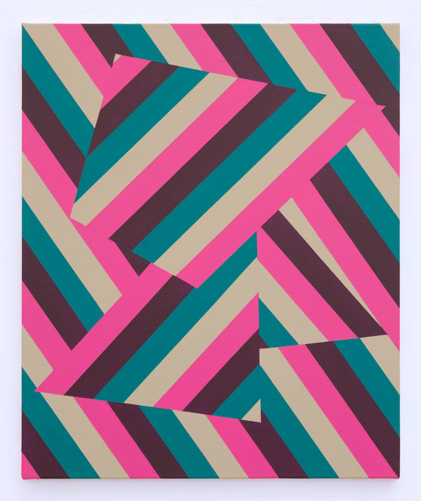
For British artist Chris Daniels, colour is everything. His bold works are a colourscape of rich hues, held in check by patterns of restrained geometric, abstract forms. The repetition is hypnotic and evocative, creating optical rhythms that play with your sense of perception. He chats to us about what inspires him and how his process and style has evolved.
How did your style and emphasis on colour and form evolve?
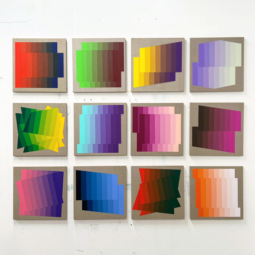
I used to make abstract paintings that included aspects of colour and form, but these were parts of the whole. As I focused my practice at the Royal Academy Schools, paintings became less cluttered, colour and form came to the forefront, and I felt confident in allowing them to be the substance of the work. I tend to make work in series, and once the structure or templates are created, I use different colour combinations to create new works in the sequence. In this way, an initial work is then evolved though the chromatic choices, and each work builds on the preceding one. Some series number over 80 paintings, I work on these until I run out of enthusiasm and feel I’ve reached an end point. There is a quote by Ellsworth Kelly that resonates with my approach, “Colour plus form is the content”.
Tell us about your process, from initial idea to completion.
The initial idea for a painting is based on creating a structure to contain the colour choices. The form is then measured and drawn out, and areas are masked off with tape, I use a lot of masking tape in the painting process. The colours are either used straight from the tube or mixed to create gradients and applied to the masked areas. I use multiple layers of paint to get a consistent surface of evenly spread pigment. The edges will often require touching at the end to fix errors, I look to achieve the appearance of perfection without becoming too obsessed by it. After many years of practice, I’m pretty good at getting a crisp edge with tape.
Is there a particular artistic movement that influenced you the most?
Artists involved with the Bauhaus movement have been the most pivotal in developing my practice, particularly Albers and his approach to colour. Other artists such as Mondrian, Jeremy Moon and Bernard Frize have also been big influences along the way.
What inspires you now?
Right now, I’m interested in gradients between two or three colours. I have made a lot of work based on the “Mach Bands” visual illusion, which illustrated an interesting effect involving edge perception between bands of colour in a gradient. This visual crimping effect has been my main interest for the last couple of years, and I’m endlessly fascinated by the colours produced in the mixing.
What advice would you give to an aspiring artist?
To make as much work as you can, and to keep experimenting with ideas that interest you, rather than looking for a finished work. Don’t be afraid of failure, build on your experiences.
Are there are new projects or directions you’re working on?
I find that my interest in colour and form is an ongoing investigation, and it is always producing new directions to take the work, it’s a lifelong project. So, there are deviations but it’s the same journey.
Quick Fire
Favourite living artist Leon Wuidar, there has been some incredible shows of his paintings at White Cube recently.
Most loved artwork ‘Shadows’, 1978-9 by Andy Warhol, which is cheating a little as it’s an installation made of 100 artworks.
Favourite museum Dia Beacon, a great museum near the Hudson river, New York. The Andy Warhol piece above can be seen there.
Favourite city To visit, Tokyo.
Who would you most like to see headline Glastonbury Boygenius. If I was at Glastonbury this year, I’d be checking out Alvvays, Soccer Mommy and the National.